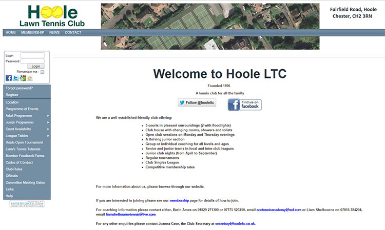
Who doesn't love a bit of 'objects-as-letters' action and here it is again our old friend the tennis ball. I jumped at the opportunity to create the identity for my local tennis club, Hoole Lawn Tennis, because quite frankly who could resist adding a couple of tennis balls in the middle of the word 'Hoole'.I think you'll all agree it looks incredibly boss coupled with a nice bit of unassuming Helvetica. Yes the old trusty Helvetica, it always looks so achingly 'designed'. So there you have it, a fab logo for a tennis club. Boom!